American Kennel Club (AKC) is a not-for-profit brand that is nationally recognized as a trusted expert in breed, health, and training information for all dogs.
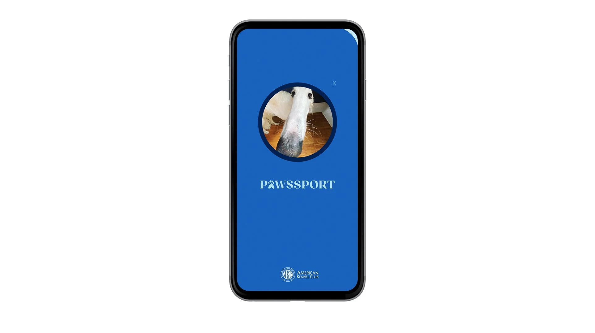
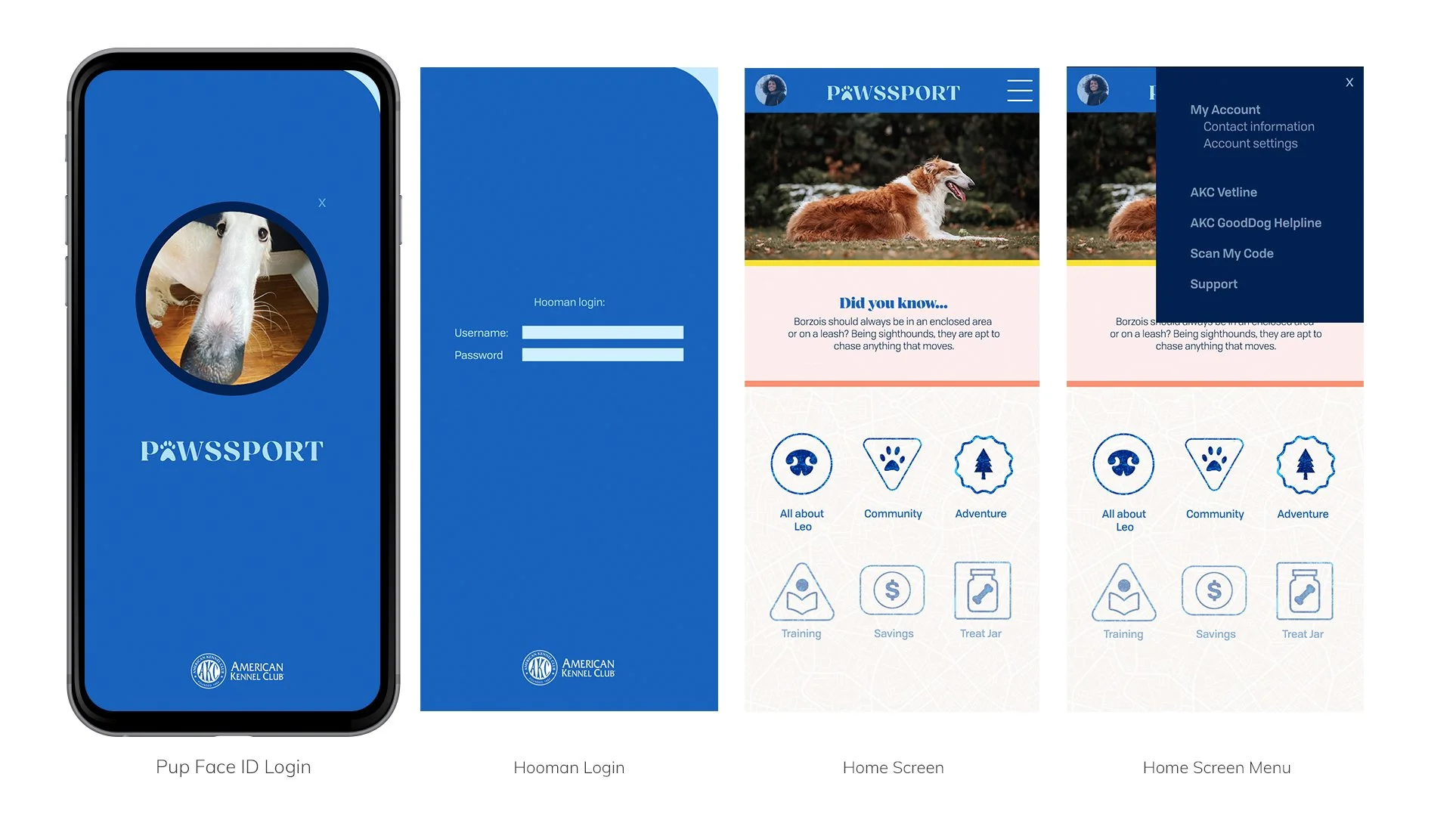
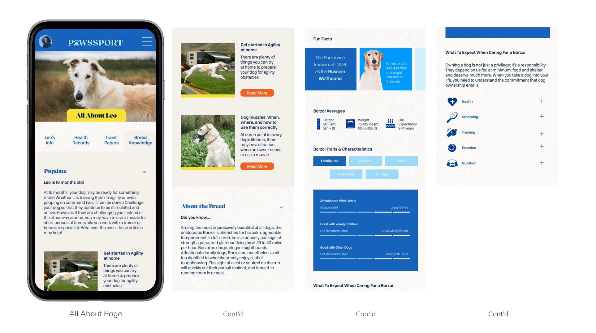
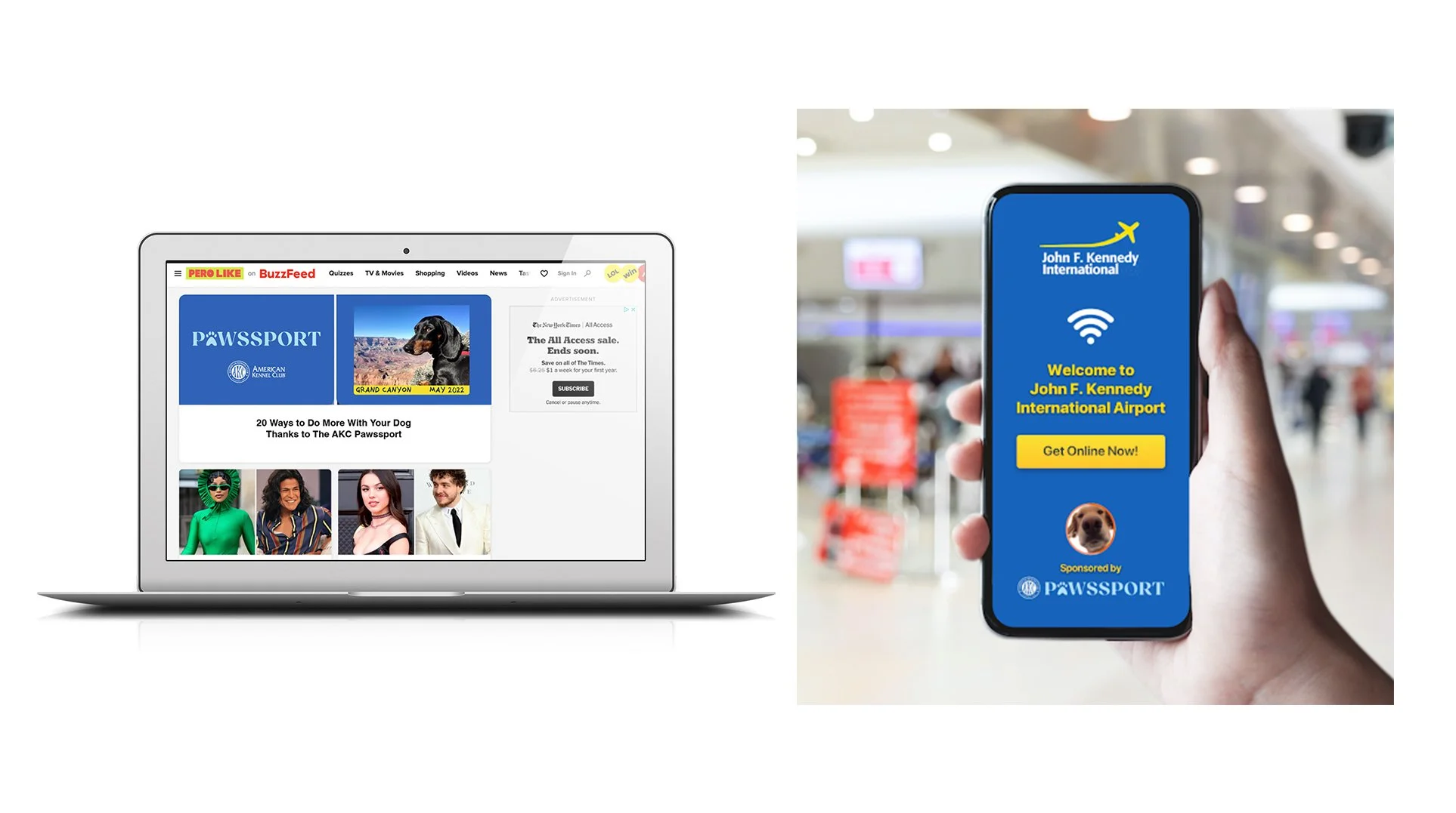
AKC needed a way to appeal to a new target audience - urban GenZ dog owners, and incentivize them to register their pet with AKC. The problem we saw was that registration had little to no tangible benefits, and so we created the idea of a Pawssport - a passport for pups. The AKC Pawssport would utilize real, useful tools like easy access to a pets registration papers, health info and breed knowledge, connections to other dog owners in the neighborhood, resources to help solve real-life challenges, and discounts and incentives on things dog owners need.
Date: August 2023 | Client: American Kennel Club | Role: UX Designer, Art Director
Gen Z is the first generation to spend longer each day online via their mobile device than all other devices combined.
* 57% of Gen Zers have downloaded a QSR loyalty app on their phone, unlocking access to exclusive offers and perks.
* 40% currently pay for a subscription service, citing savings (23% ) and added value (17%) as reasons for signing up.
Gen Z, in particular looks to digital communities to create a sense of belonging, with 65% stating they feel more confident using apps with social communities over more traditional feed-centric apps like Instagram and Twitter.
To directly drive app downloads, we focused on channels that offer an “Install Now” CTA and conversion goal, such as Meta and TikTok
Tapping into lifestyle sites like BuzzFeed, R29, and PureWow that have an already established, credible voice among a relevant Gen Z and Gen Y audience base helps with both awareness and trustworthiness.
To further play on the passport theme and align the AKC Pawssport with Gen Z travelers, we proposed partnering with a vendor like Boingo to provide free airport wifi to users who unlock the feature by watching an AKC-branded video or engaging with content.
Spirit of America is a nonprofit recognized by Congress and approved by the Department of Defense to work alongside deployed US troops and provide private assistance to meet the local needs they identify.
We worked with Spirit of America to assess their current website and identify missed opportunities and room for an improved user experience for their primary audience of donors. We re-designed multiple pages throughout the site to optimize UX and drive donations.
Date: Jan- March 2024 | Client: Spirit of America | Role: UX Designer
The previous navigation of the site was duplicative, inconsistent, and didn’t lead to a clear user journey. We revised the sitemap to streamline content and put donors (especially new donors) at the center of how SOA displays their work.
The website previously had over 3,700 pages including years of blog posts that were not searchable. We revamped the blog by adding categories and tags to help users sort information into what’s most interesting for them and included related content at the end of each blog to assist in continuity.
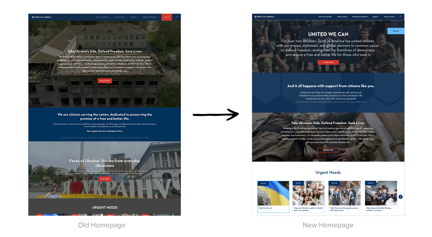
Aside from implementing new branded elements through the site and updating the navigation we also re-designed many of the sites pages. The first of which was the homepage. Previously, the content on the homepage wasn’t hierarchical or actionable. A first-time user was met with a CTA to explore the orgs 20 year history before understanding who they are or what they do. The Donate CTA didn’t pass accessibility guidelines for color contrast and wasn’t always present as the user navigated the website.
The homepage hero featured SOAs efforts in Ukraine, which is a main focus for the org. However, using the top real estate to introduce who Spirit of America is and why they do what they do worked to lay a strong foundation and facilitate pivoting to all the active projects they are currently prioritizing.
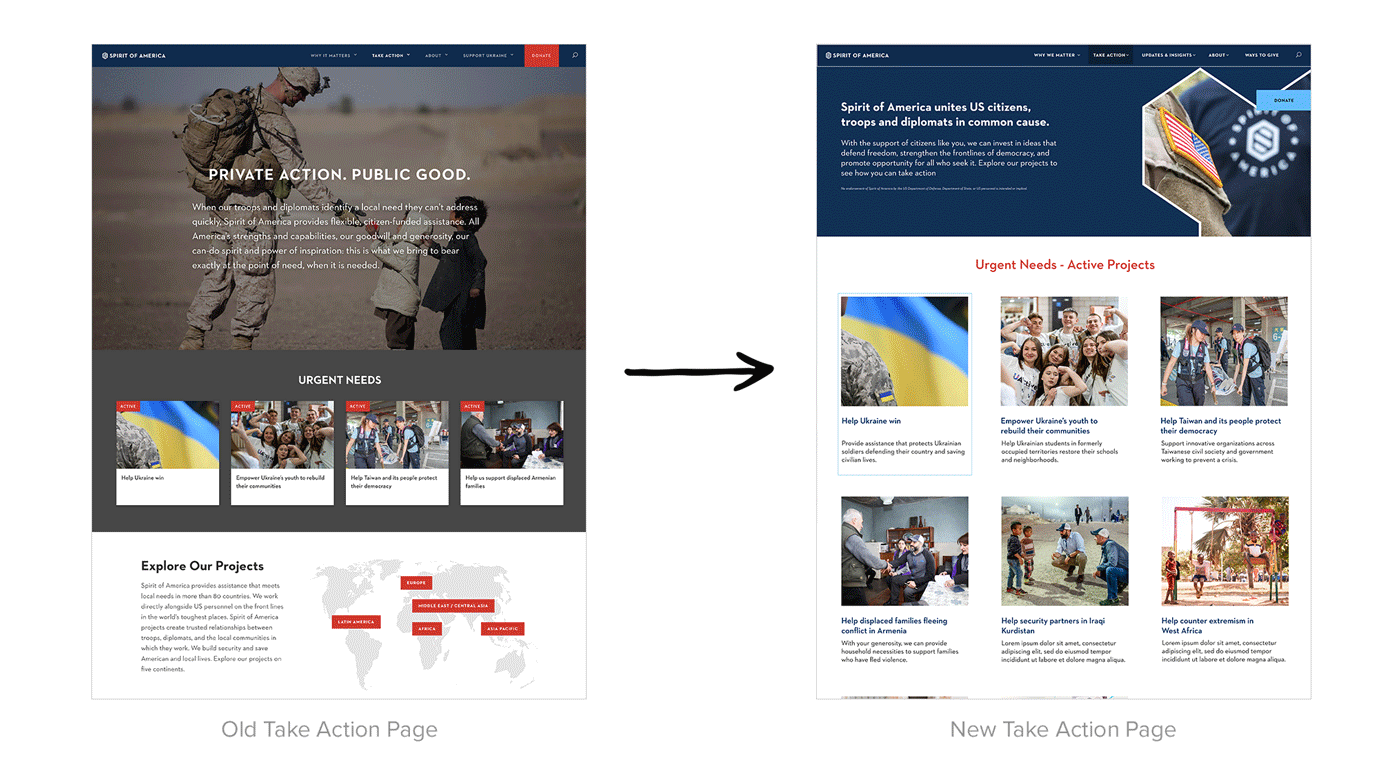
We found that the approach of dividing projects by region wasn’t useful since there were only 6 active urgent needs and there wasn’t enough content to fill various regions. Instead of leading the user to a dead-end, we removed the map and instead implemented an organized grid to call attention to the most relevant projects. We also included a carousel of previously completed projects at the bottom to showcase past successes and highlight previous donor impact.
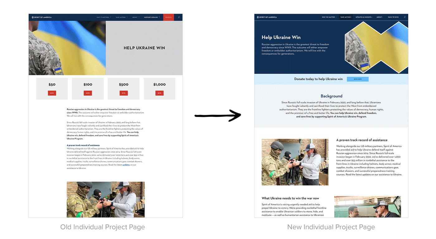
The previous individual project pages lacked context and structure. The user was presented with dollar amounts to donate before being told what the project is or why it matters. We restructured these pages to provide project background information first and implement various donation CTAs throughout the page.
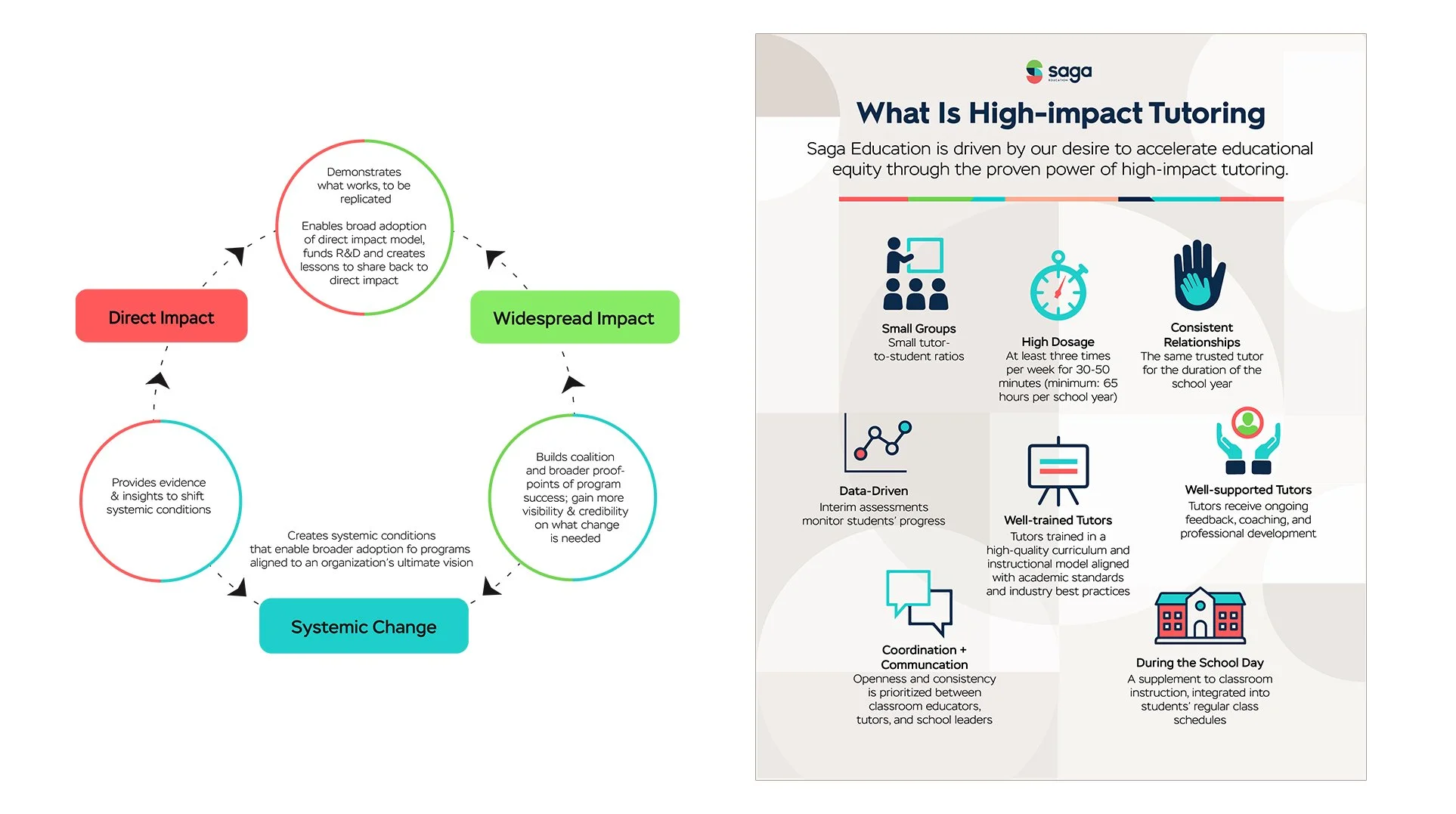
Saga Education is a national leader in high-impact, in-school tutoring. They leverage the power of human capital and technology to accelerate student outcomes and create more equitable learning for students.
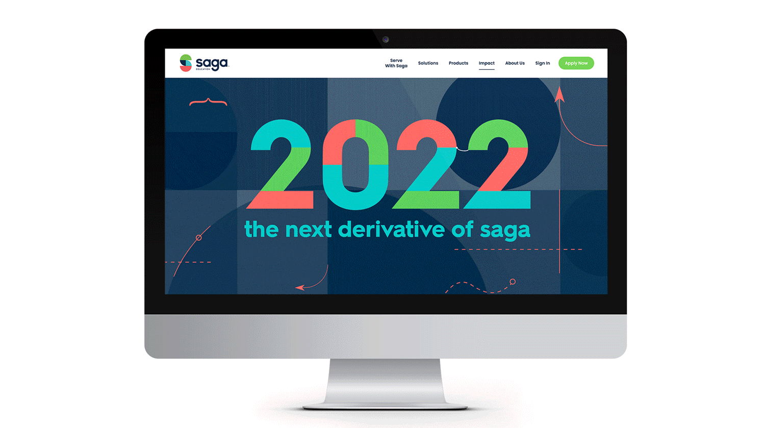
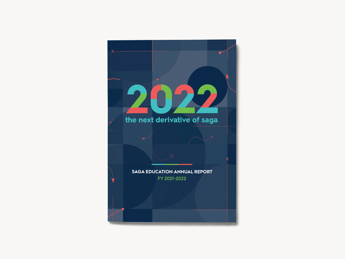
Guiding the client through both concept and content, I worked to develop Saga’s 2022 Annual Report which took shape as a dynamic webpage and a downloadable booklet. We received a Hermes award in best annual report for this work.
Date: Jan 2023 | Client: Saga Education | Role: UX Designer, Art Director
“The next derivative of Saga” was chosen as our concept and theme highlighting Saga’s most recent advancements over the course of the year while nodding to the organization’s focus on math tutoring.
Throughout the report we used animated infographics to call out the most impactful concepts, statistics and data-proof points.